
01 CONCEPT
Highlighting the essence of the interior design
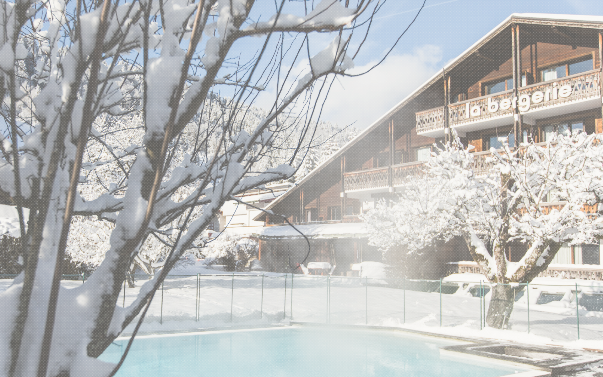
Our concept draws inspiration from the hotel’s architectural essence, emphasising geometric elements that mirror the refined interior details. We crafted a refreshed identity that blends contemporary aesthetics with these architectural features, creating a cohesive brand that amplifies the hotel’s modern appeal online.

02 VISUAL IDENTITY
Design with authentic warmth
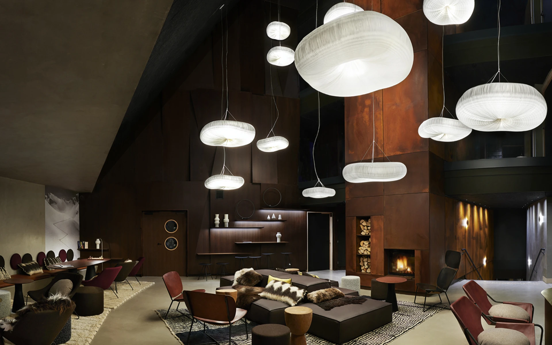
We crafted a distinctive wordmark inspired by the hotel’s geometric architecture features, while the bespoke colour palette draws on the warm tones of the interiors. This combination evokes comfort and a home-like atmosphere, ensuring the brand feels approachable, modern, and closely tied to its architecture and interior design.


Our colour palette draws directly from the warm, inviting tones of the hotel interior design, creating a strong link between the spaces and our brand visuals. These colours convey a sense of comfort and elegance, reinforcing theMiL8 welcoming character in all communications and materials for a unified, cohesive look.

Our primary typeface is Georgia, chosen for its classic and readable style. We use Georgia Bold for French text to give it a clear, strong look, while English text appears in Georgia Italic for a softer emphasis. This approach makes it easy to distinguish between languages and ensures consistency across all brand materials.
03 APPLICATION
Modern geometry meets cozy design
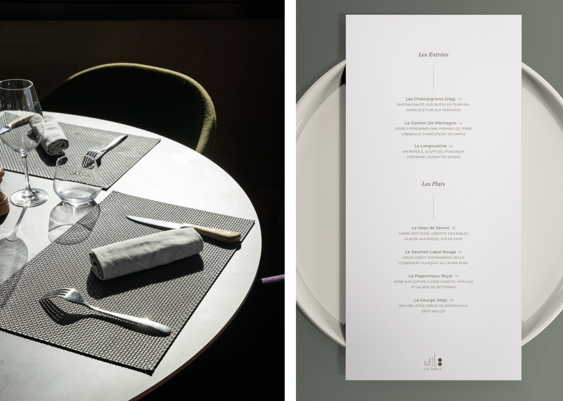
We brought the MiL8's brand identity to life across a range of applications, from hotel room stationery to restaurant menus and bar coasters. Each touchpoint reflects the blend of contemporary design and warm, playful and welcoming atmosphere that defines the hotel, ensuring consistency across the entire guest experience.


social media
04 CREATIVE PRODUCTION
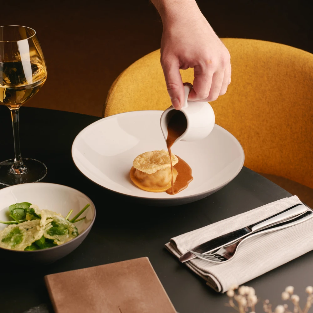
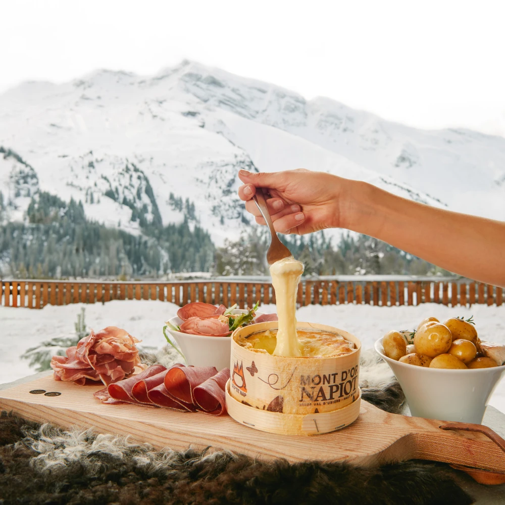
A modern take on mountain flavours
We showcased the MiL8’s food and drink offerings by focusing on regional ingredients and mountain heritage, presented through a modern lens. The imagery celebrates the authenticity and quality of each dish, blending tradition with contemporary style to reflect the hotel’s elevated atmosphere.


05 SOCIAL MEDIA
Refined Alpine aesthetics
We elevated the MiL8’s Instagram presence by embracing the refreshed brand colours and moving away from traditional blue tones, setting the hotel apart from other mountain resorts. This cohesive approach resulted in a striking and memorable design-led feed that strengthens MiL8’s modern alpine identity, driving engagement and expanding its reach across platforms.
We transformed the hotel’s Instagram feed, aligning its aesthetic with the new brand colours to create a cohesive and harmonious look. Observing that most mountain hotels lean on blue tones from the landscape, we intentionally removed blue from our palette. This distinctive choice sets the MiL8 apart, making the feed more memorable while reflecting the hotel’s refreshed visual identity across all platforms.


+1,405% of account engaged
+308% new audience reached
+240% website clicks increase